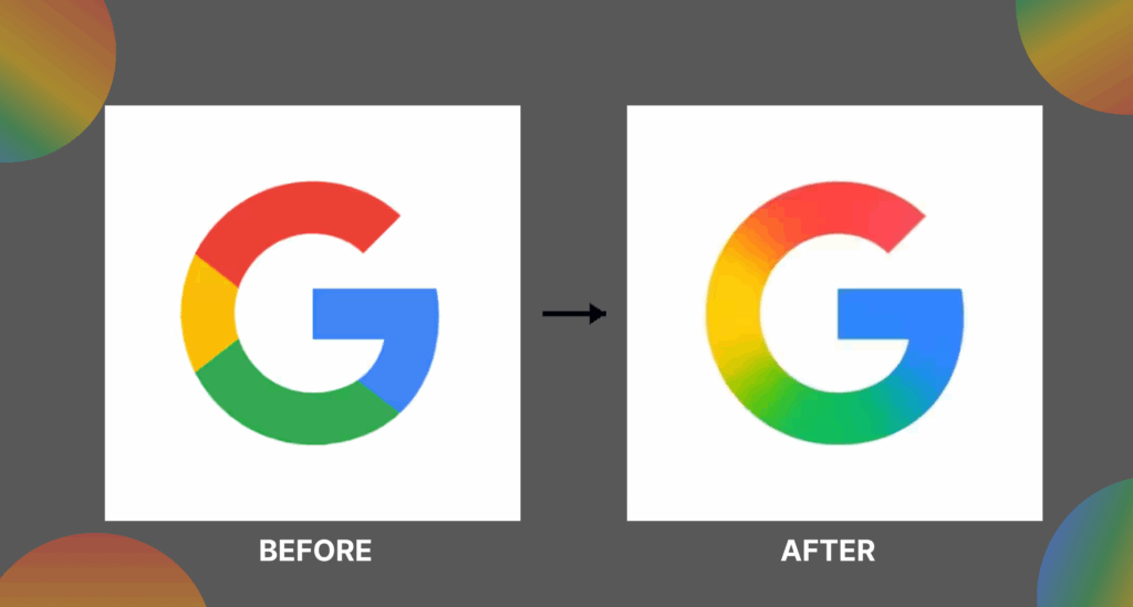
In a subtle yet significant move, Google has updated its iconic “G” logo for the first time since 2015. The new design replaces the familiar solid red, yellow, green, and blue segments with a smooth gradient transition, giving the logo a modern and dynamic feel. This redesign aligns with Google’s evolving visual identity, particularly its focus on artificial intelligence and design consistency across platforms like the Gemini AI chatbot, which also features blended color gradients.
Currently, the updated logo is visible on the Google app for iOS and Pixel devices. However, the web and other Android users may still see the older version as Google gradually rolls out the change. While there’s been no official announcement from Google explaining the full rationale, many believe this update reflects the company’s shift toward a more fluid and futuristic branding style.
This redesign not only modernizes the look but also subtly reinforces Google’s commitment to innovation, technology, and user experience in the AI-driven digital era.